Case Study
Pantheon

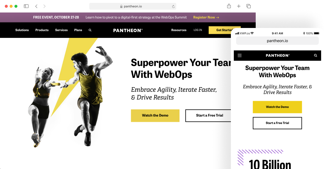
Pantheon is one of the fastest, most reliable WebOps platforms online today. Their goal is to provide the world with tech that empowers teams with the speed and WebOps experience they need to succeed. On the platform side, they achieve that goal with a lightning-fast hosting service that customers love. But with the help of Geeks & Nomads, they realized that this core tenant of their philosophy wasn’t reflected in their own website.
Their user experience wasn’t optimized, it hadn’t been tested, value propositions were getting lost, and the site’s speed didn’t match up with that of their platform.
Performance is about so much more than just speed. It depends on every experience a user has on a website: accessibility, copywriting, the journey, and yes, what goes on behind the scenes to load a site lightning fast.
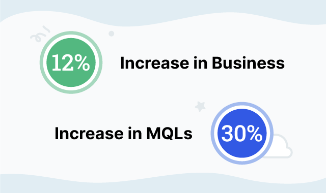
After identifying multiple opportunities for improvement, we worked hand in hand with the Pantheon team to improve their site’s performance. Starting with a user experience study of the site that led to design adjustments, and eventually to backend script optimizations and everything in between, our work has helped improve MQLs by 30% and overall sales by 12%.
The Beginning Of A Partnership
We began our work with Pantheon with a few simple suggestions. We saw multiple areas on their site that could use improvement. Then one of our resident UX architects began analyzing the site from all possible angles through a heuristic evaluation of their site from a user’s perspective.
- Was the main navigation user-friendly?
- Was the color scheme accessible?
- Was the copywriting sales- or user-centric?
We then performed a research study to find out how real users were interacting with the platform. This research showed that:
- 40% of users were not clear about Pantheon’s value proposition. Others said they were still lacking clarity even after moving forward.
- 20% of users struggled to find the necessary details about plans/pricing.
- 50% of users experienced frustration with CTAs on the site, citing duplicate page destinations or too many calls to action.
These findings laid the groundwork for a breadth of UX-related improvements to come, along with another huge area of focus. That is, of course, page speed. One of the biggest barriers holding back user experience for most sites is the critical rendering path: Does the site actually load content in an engaging and quick way?
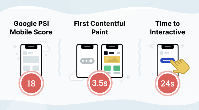
Our UX study showed that Pantheon’s homepage could take up to 29 seconds to load on a mid-spec mobile device running on a 3G connection. After we ran a series of tests using Google PageSpeed Insights, we realized that there were a variety of performance issues with the site.
While it was easy for our team to identify these issues, it can be difficult for teams to act on them alone. Pantheon’s development team was busy enough updating their platform and website. Spending weeks on optimizations proved to be impossible without more support. Working together, we set out to make their website’s pagespeed match their famously lightning-fast platform.
Let's Get To Work
After completing our initial discovery phase, the Geeks & Nomads team began searching for ways to improve performance and user experience across the Pantheon site. Working hand in hand with their team, we discovered many areas of the site that could be improved with UX changes.
UX Improvements
Our team suggested a number of improvements on the Pantheon homepage.

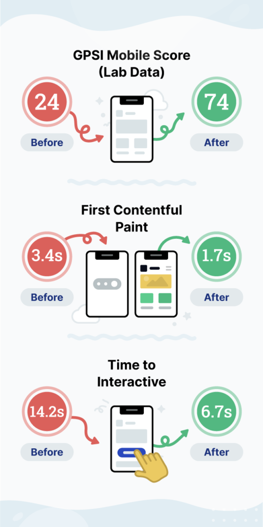
Further, we were able to implement efficient font display fallbacks that virtually removed all layout shifts from the site and reduced the scripts necessary to load the site. The Time To Interactive (TTI) was reduced by 75%, meaning pages can be interacted with faster on each page load, influencing Bounce Rate, Conversion, and overall brand trust.
- Rewrite value proposition to make it more clear to users.
- Rewrite CTA’s to make them more action-oriented.
- Maps showed that users found these statistics were getting tons of engagement, but they were not clickable or expandable in their current form. We suggested expanding on these numbers and giving users more information about the kinds of sites hosted and created with Pantheon’s platform.
- 100% of users tested showed strong negative reactions to the popups used on Pantheon’s homepage. Instead of removal, we suggested evaluating the efficacy of these popups and how they might be optimized to achieve Pantheon’s goals.



Accessibility Improvements
In addition to numerous other UX improvements, our team also suggested a variety of changes to increase Pantheon’s accessibility to all users.
- Users can ‘Tab’ forward through the main navigation, but not back.
- Users were unable to dismiss popup ads with keyboard or speech commands.
- The blue color used by Pantheon did not meet the 2.1 web accessibility standards.
- Image alt text was either unspecified or used in an unusual way. We informed the team of alt text best practices and how to improve image function.
- Forms on Pantheon’s site were difficult to understand and fill out. We suggested improving the accessibility of these forms to increase fills.
Performance Improvements
Starting with the initial website performance reviews, we identified improvements that would have the biggest impact on site speed and performance. We suggested these changes to the Pantheon team and they were elated to start the work.
Basic Render Blocking
Purged stylesheets of unused elements, and asynchronously loaded non-critical stylesheets.
Media And Asset Delivery
- Optimized images and SVG illustrations.
- Turned on lazy load to prevent out-of-view images from competing for network resources.
- Converted GIFs to embedded video to use bandwidth more efficientl
Reducing Script Payloads
Configured lazy load on excessive scripts to reduce DOM sizes and improve performance.
Modernizing Javascript
Loaded async or deferred scripts and focused on what needs to be quickly available, pushing back less important scripts.
Optimizing Styles Delivery
Loading critical styles inline drastically helped improve performance.
Once we made our observations and gathered our work for the Pantheon team, we set to work seeing which fixes were actionable and which would need more time to implement. A variety of UX improvements were quickly tested and implemented, the most impressive of which was one of the simplest. In rearranging the main navigation on the site, as well as re-ordering some menu options, Pantheon saw:
Our development team also quickly began making a number of performance improvements that had drastic effects on Pantheon’s page speed scores. (Bear in mind that working with third-party scripts will vary the testing results.)
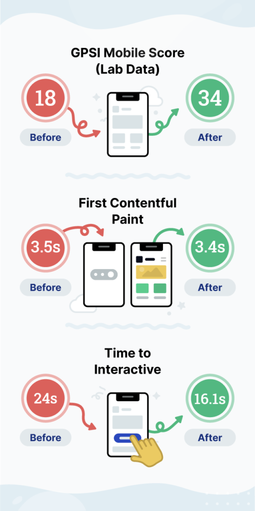
Additionally, with page- and server-level optimizations, and advanced browser caching policies in place, the scores are even higher when you look closer at what real users experience. The field data (based on CrUX data, real-user metrics as captured and reported by Google in the GPSI tools) shows real users’ performance actually beat the metrics for a score that feels closer to a 60 Mobile score.
Mobile Score
Field Data (What users are actually experiencing on Mobile, for a specific page)
FCP: 1.7s
LCP: 1.7s
FID: 14ms
CLS: 0
Origin Data (What users are actually experiencing on Mobile, as averaged across the whole site)
FCP: 3.6s
LCP: 3.7s
FID: 57ms
CLS: .03
By working with Geeks & Nomads, Pantheon has improved the baseline of performance for all users, especially when looking at the real user data provided in GPSI. While these numbers may not seem like gigantic leaps, it is important to analyze the real-world results more closely. After experiencing the site experience for yourself, let’s revisit the initial scores and some of the reasons that they may be perceived negatively by third-party scripts.
The Elephant-Sized Stack In The Room
Pantheon’s success hasn’t come out of thin air. Their marketing department has developed a targeting, lead-generating machine in their website. Using a variety of scripts running behind the scenes, they have been able to grow their business.
- Social Tracking Pixels
- Google AdWords Scripts
- A/B Testing Scripts
- Retargeting Tools
- And Many More
Our team improved Pantheon’s site performance to the best of our ability without breaking the MarTech stack they worked tirelessly to create. Although we haven’t been able to touch these scripts yet, we were able to run tests to see what it would look like if we were able to optimize them.
Our team knows that your business has worked hard to create what you have. We don’t want to come in and turn everything on its head. We want to help improve and optimize your tools. While we can’t guarantee these results for every client, we can guarantee that we’ll do everything we can to improve your page performance, and then tell you how we can do even more if we can.
A Bright Future
Pantheon knows that there’s still work to be done. While working with Geeks & Nomads has propelled their site to new heights, there are always going to be new opportunities for growth. What will next steps look like?
- Further improvements to UX by reviewing the new user journey after the work has been deployed.
- Deciding what to do with the Drupal 7 site: Does that mean updating to Drupal 8? Moving to WordPress?
- Further optimisation for speed: What else can they do to improve even further?
Whatever the future brings, Pantheon knows that they can turn to Geeks & Nomads to help keep them going in the right direction.


